
Master lighting, materials and rendering using Rhino and V-Ray with the finale in our two-part guide to creating fast-and-efficient 3D visualizations.
We conclude our detailed guide to creating impressive arch-viz renders using V-Ray 3.6 for Rhino in this finale of our two-part series. In part one, Anastasia Zhivaeva, CG Specialist at Chaos Group, walked us through the first steps in the creation of Modern House. We highly recommend checking out the first part to see how to set up the project, camera and environment assets for rendering. In part two, we’ll continue to take you through the principles of creating fast, effective and efficient visualizations using V-Ray 3.6 for Rhino — with plenty of bonus tips and tricks along the way.
Part two will cover:
- Lighting
- Materials
- Atmospheric effects
- Render settings
- Frame buffer functionalities
- Render Elements and compositing
- Post-production
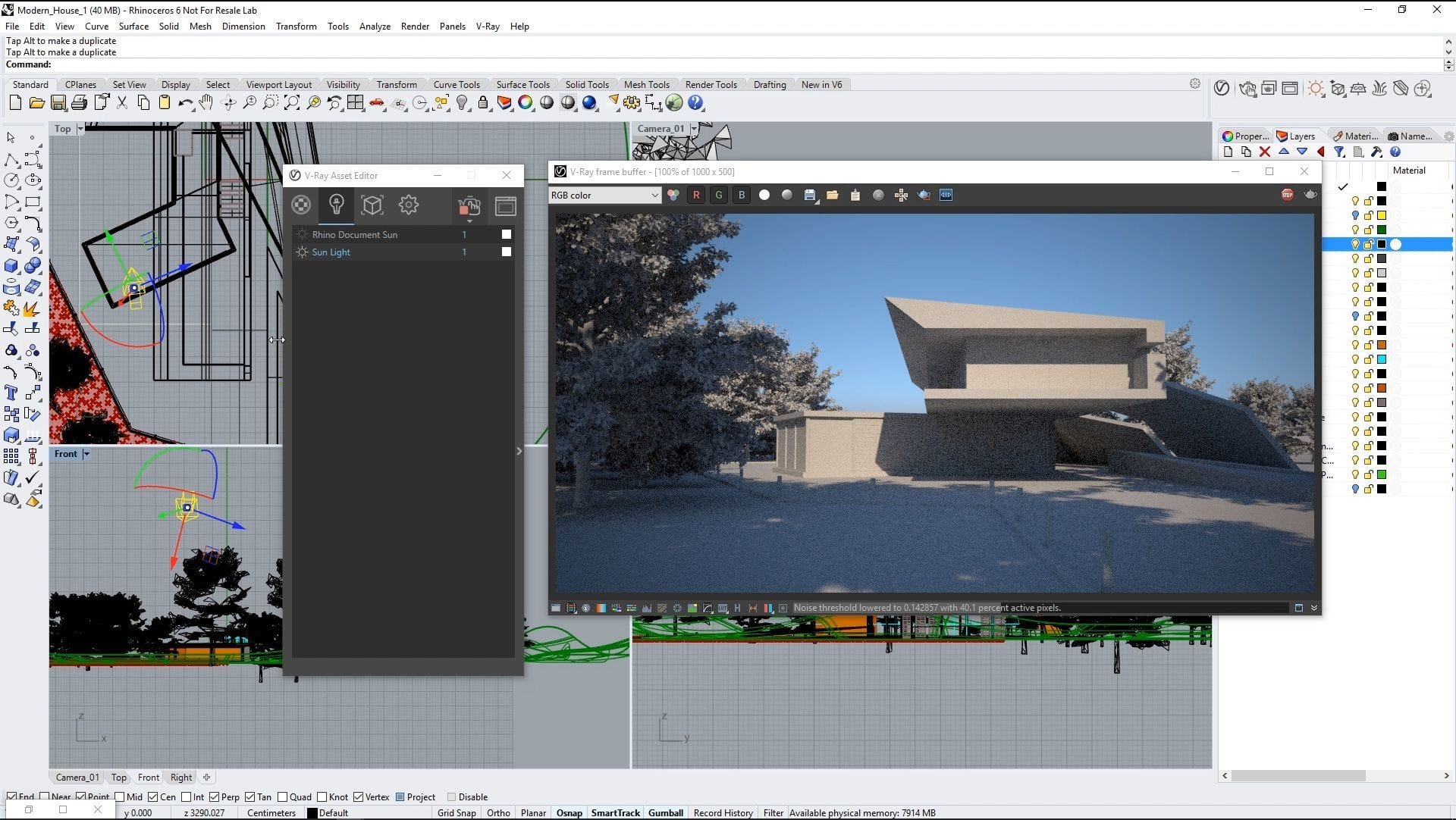
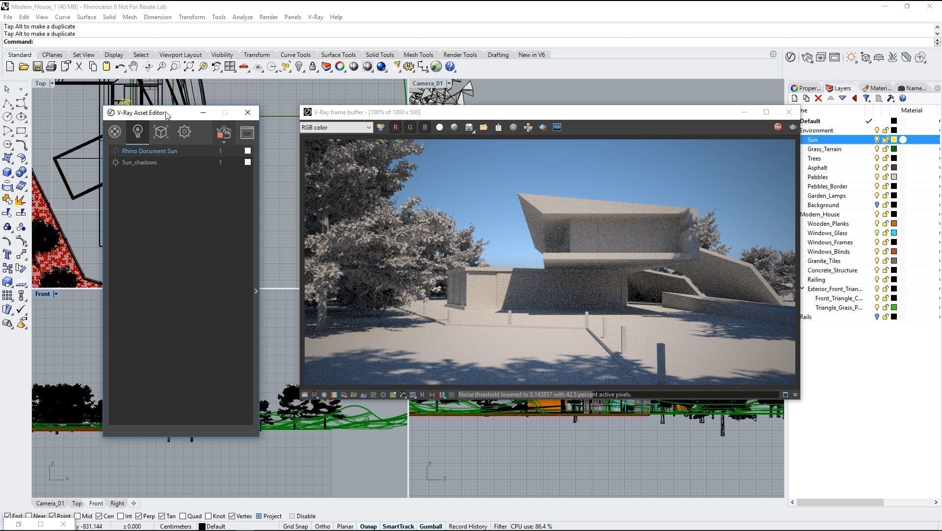
Lighting: Sun adjustment
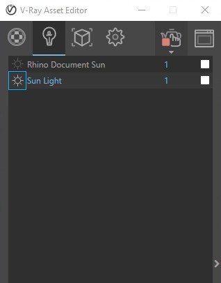
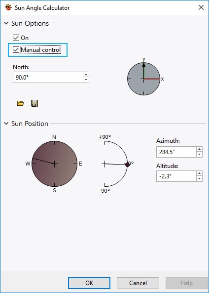
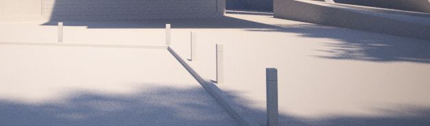
You can produce a nice shadow from the tree onto the grass, path and building by manually adjusting Rhino Sun. However, there is a much quicker way to change its position: Turn off Rhino Document Sun from the Asset Editor, select the V-Ray Sun creation panel, check the Manual control setting in the window, and then place the gizmo anywhere in the scene.
I decide to rotate it directly in the viewport until I’m happy with the way it looks. Increasing the size multiplier makes the shadows blurrier, helping you to achieve a particular look or adjust the shadows to suit the time of day. I prefer to use a value of three here to give my shadows a little blur.
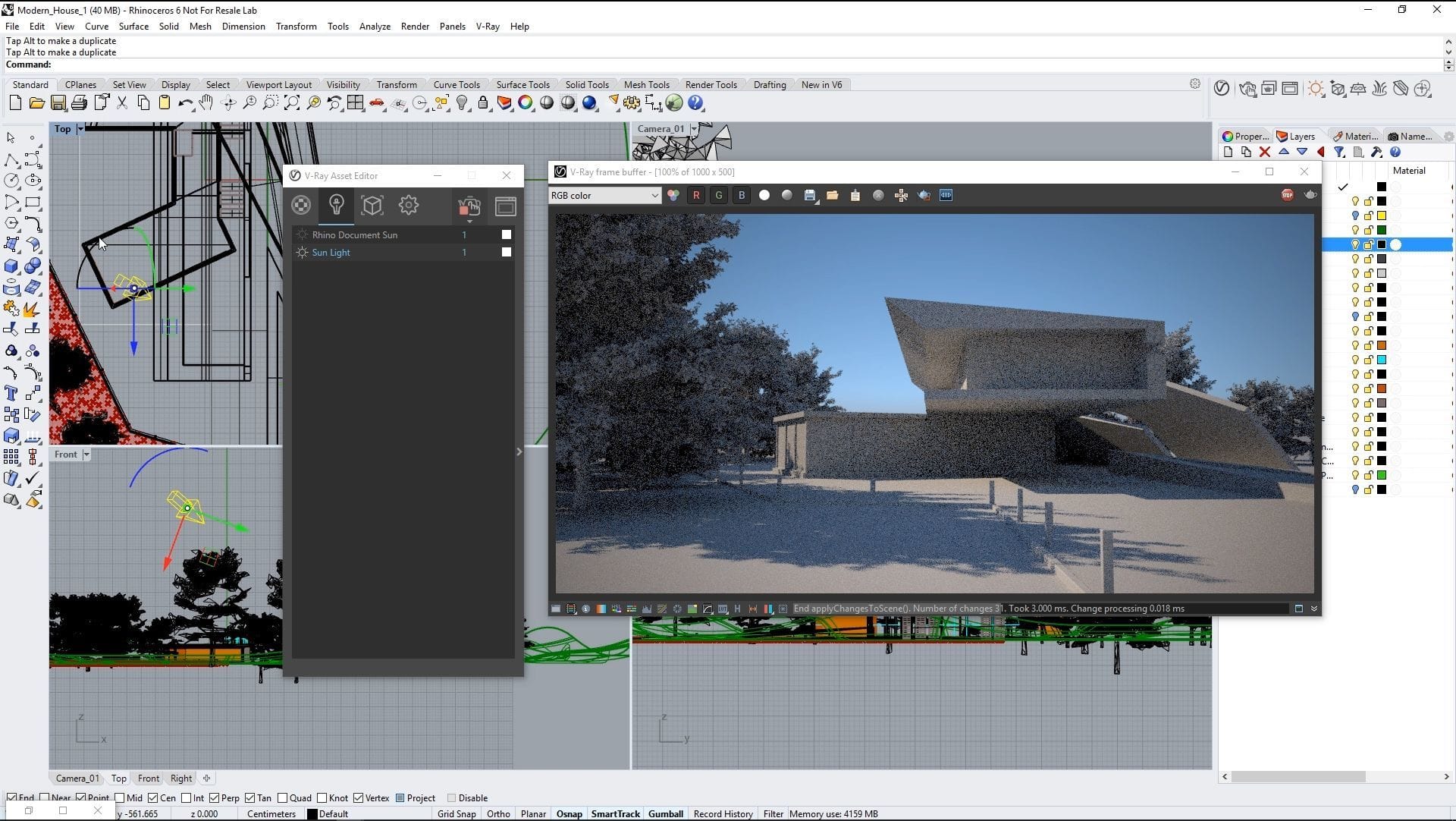
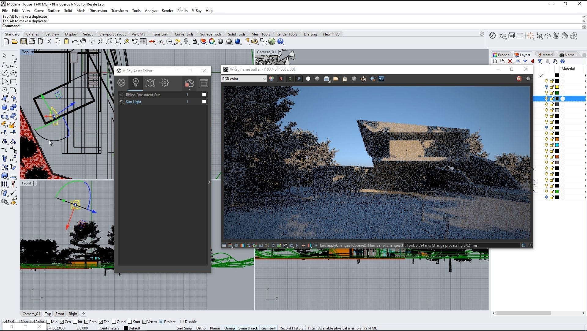
The results after rotating the gizmo in the scene.
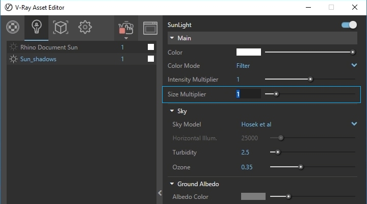
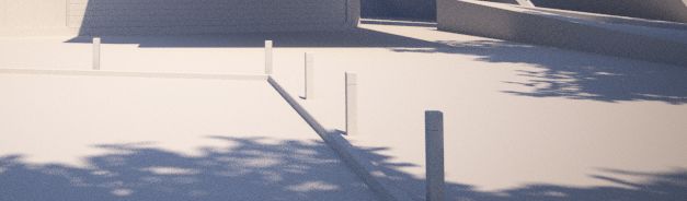
Size multiplier = 1
Size multiplier = 3
Before moving onto the materials, I want to add some extra detail to the environment: mountains. I position four surfaces behind the building, with a standard material applied to them. I use an image of mountains in the Diffuse slot for all surfaces and a mask in the Opacity slot to make the sky area transparent.
Materials
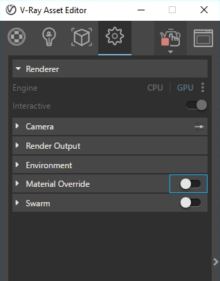
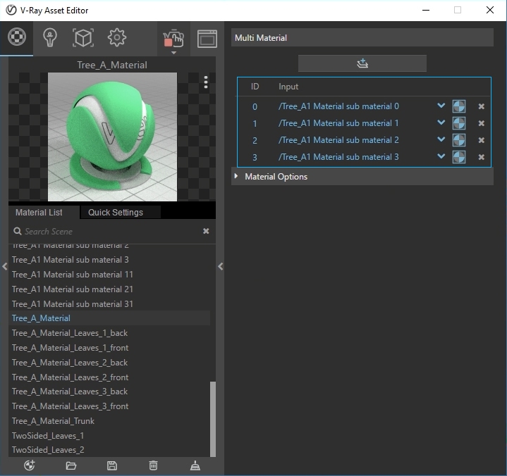
I begin this step by disabling Material Override. At the moment, the proxies render in various colors because they don’t save specific material information. Once you import the proxies into the scene, you will need to reapply the materials through the material editor. Proxies come with placeholders for shaders.
Here I have four, but they could vary depending on the face IDs that were created when exported from the software. To create face IDs when exporting geometry as a proxy from Rhino, I first apply materials to the mesh and then use the Export Proxy tool.
For this scene, I have already prepared a simple material for the bark and three materials for the leaves.
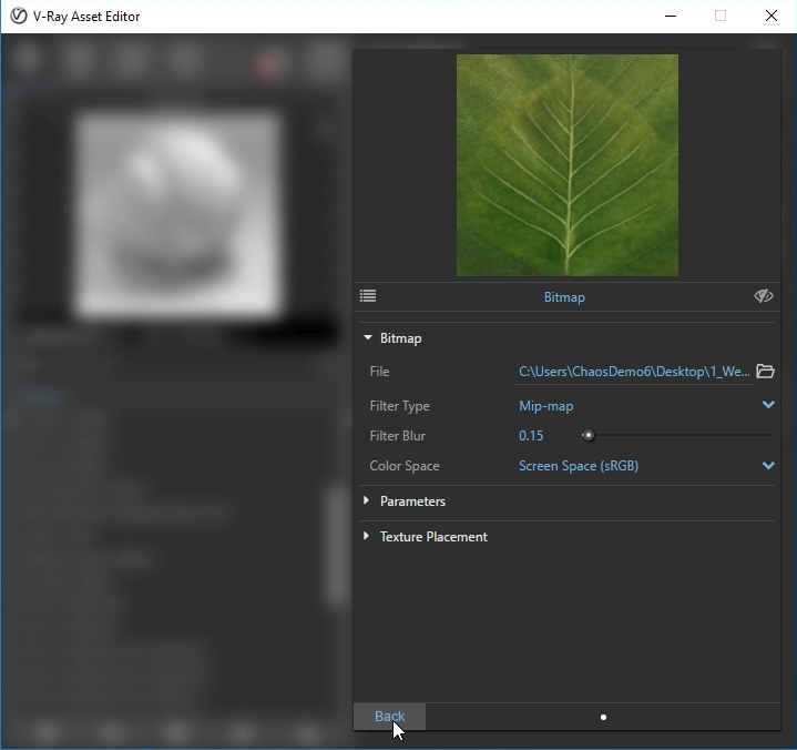
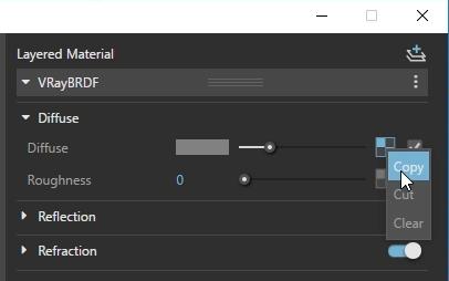
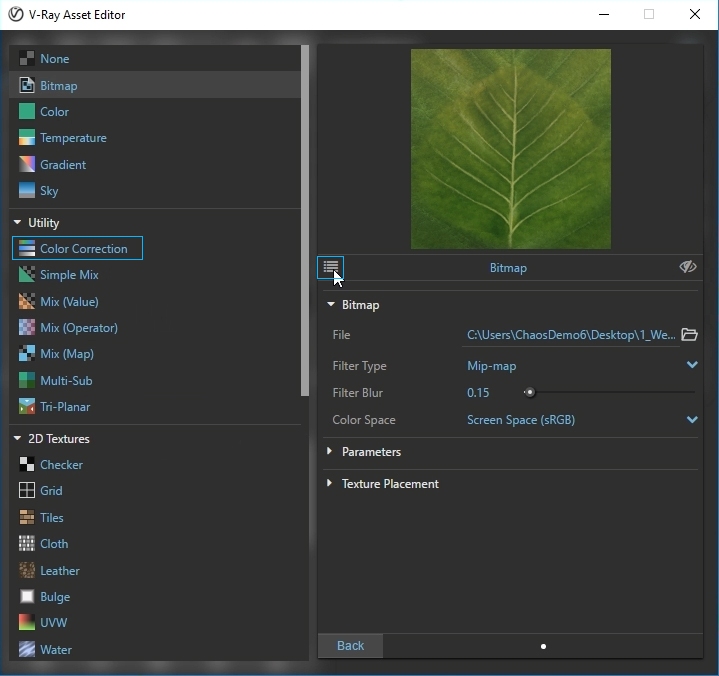
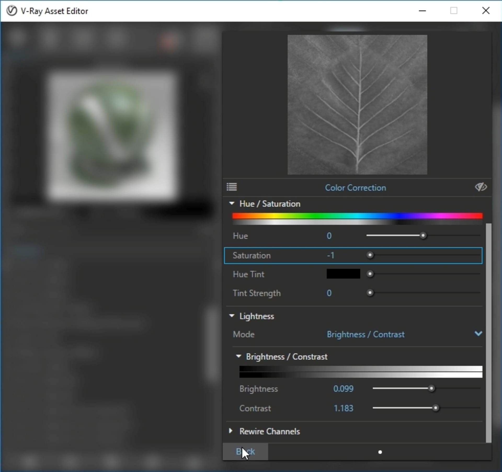
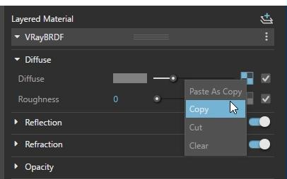
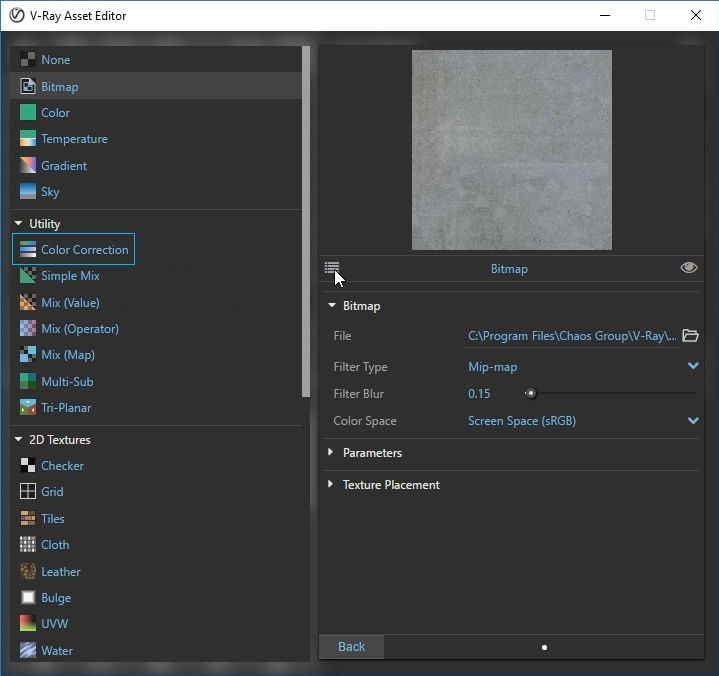
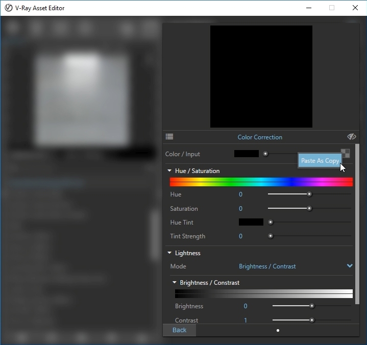
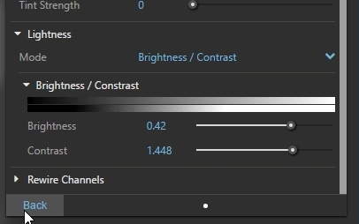
For the leaves, I start with a simple Generic material. In the Diffuse slot, I use an image of a leaf; I only have one bitmap for the diffuse of all leaves, so to avoid repetition I copy the bitmap and, in its place, select a color-correction node. I can now paste the bitmap in the color/input slot. The color-correction node gives me the freedom to make basic adjustments to the image — such as changing the hue, correcting the saturation, or adjusting the brightness and contrast.
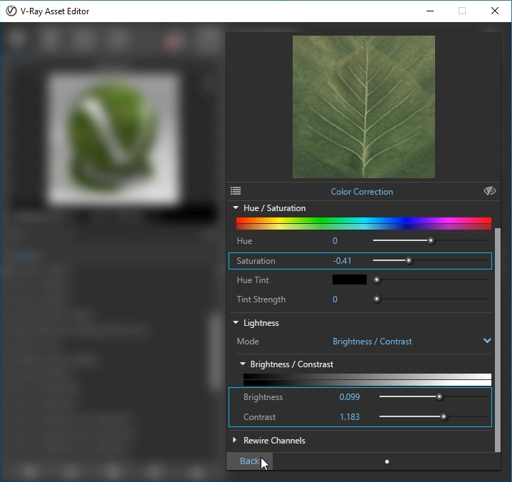
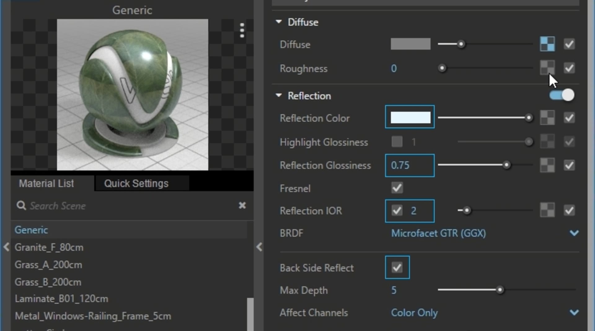
Adding reflections to the leaves will make them look livelier. I slightly change the Reflection Color to blue to enhance the reflection of the clear sky, lower the Reflection Glossiness to make reflections more blurred, and increase the reflectivity by adjusting the Reflection IOR to two. It’s important to check the Back Side Reflect box; this means reflections from the rear of the leaves will be calculated — this is useful because some of them face the camera. For the Bump slot, I copy the diffuse and bring the saturation all the way down to make it black and white.
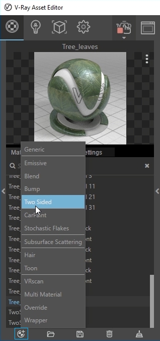
Using the Generic material directly for the leaves will make them look like solid shapes, but an easy solution is to use the Two Sided material option. Since this material can accurately simulate light leaking from the back side of materials, it’s a great choice for thin, translucent surfaces such as paper, cloth, curtains and leaves.
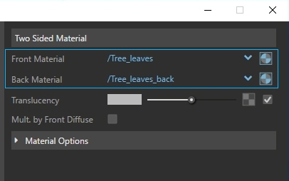
I select the shader that I created for the front material slot, duplicate the material and change the saturation for the back. I could have used the same front material but I prefer altering the saturation as this adds more color variation.
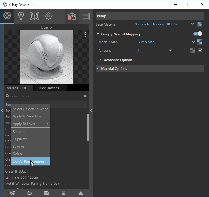
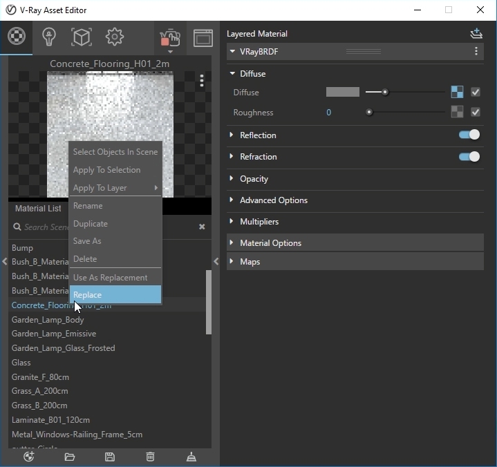
I can now replace the colors of the proxies with the actual shaders. You can make corrections — or even replace them with a different material — at any time. For easy access, click on the icon next to the arrow to open the shader.
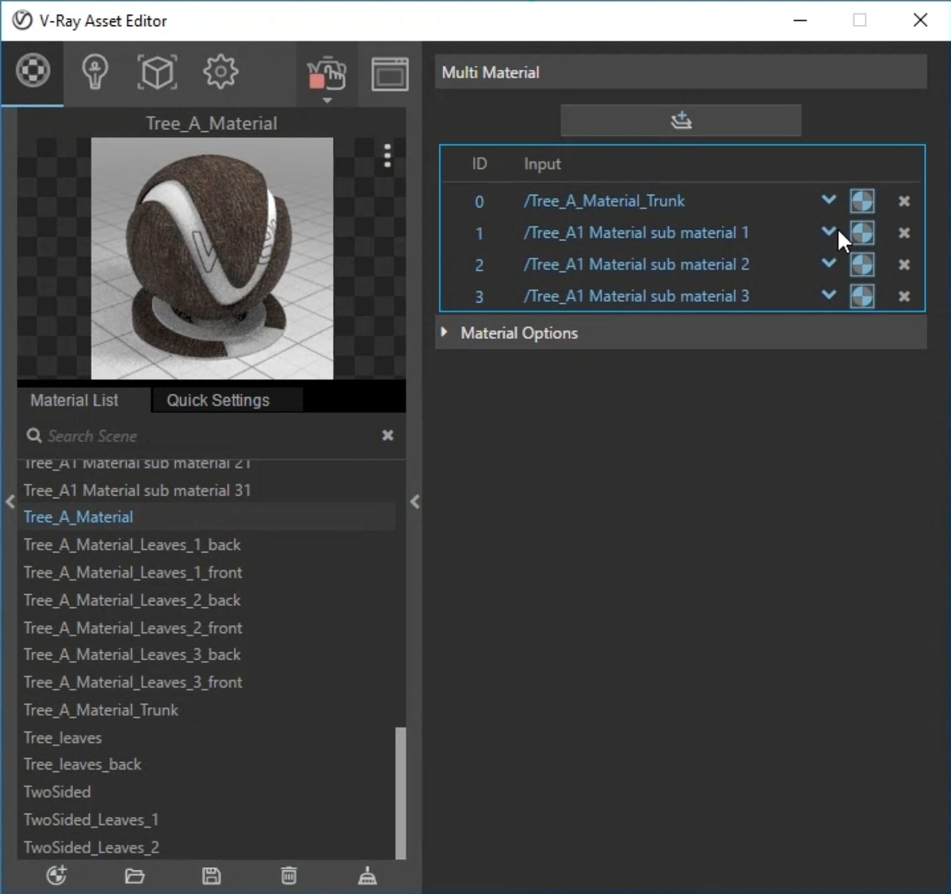
Replacing the placeholders with actual materials.
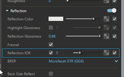
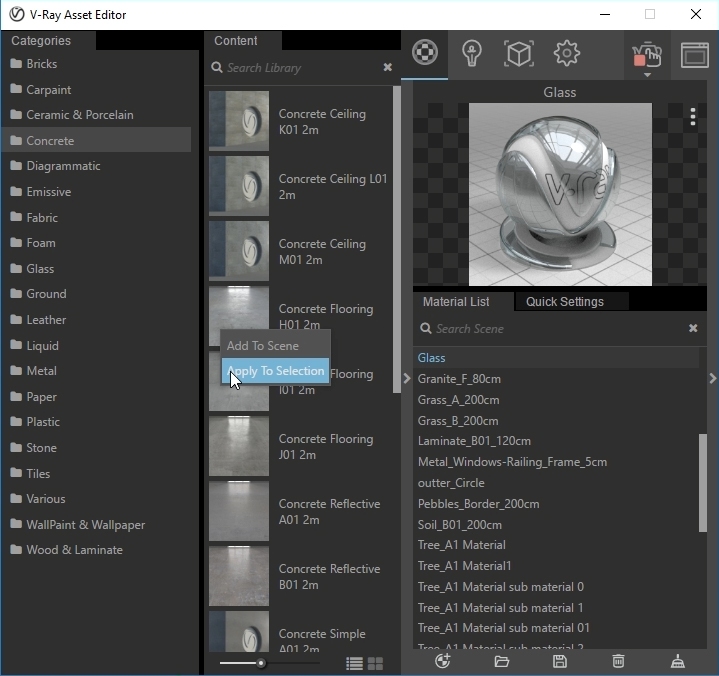
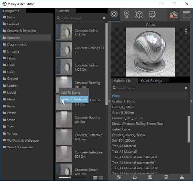
For the concrete material, I use shaders from the material library for the building. Currently, there are over 500 ready-to-use shaders to drag and drop into your project or to build on top of. I select all the Glass elements and assign a simple glass material from the library by right-clicking and choosing Apply To Selection. This shader automatically appears in my material list. To make the glass more reflective, I increase the Reflection IOR to five.
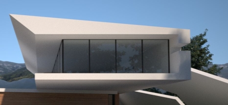
Reflection IOR = 1.6
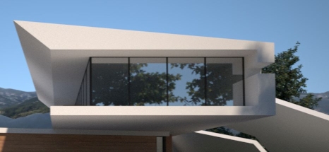
Reflection IOR = 1.6
For the concrete structure, I use the concrete floor shader. Just like the glass, first I select all the elements, right-click on the material directly in the library and choose Apply To Selection. I quickly realize this is too dark; I want something brighter so, again, I use a color-correction node but, this time, I only adjust the brightness and contrast.
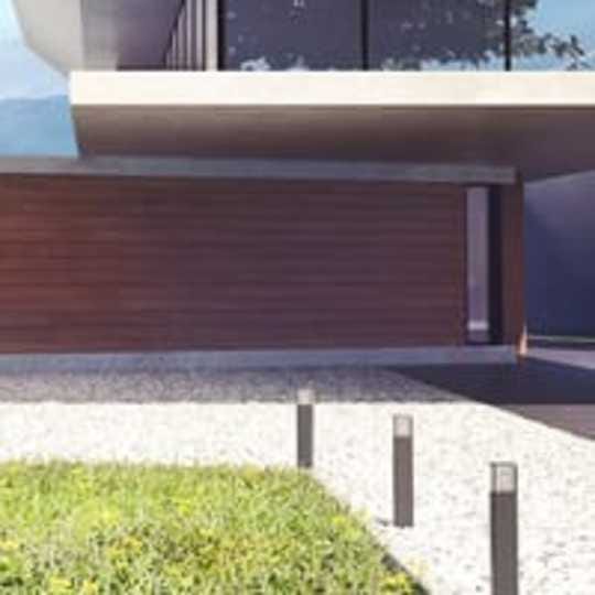
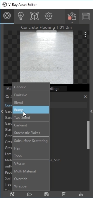
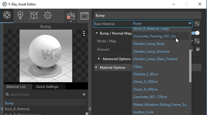
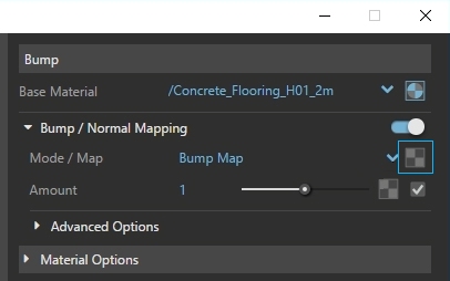
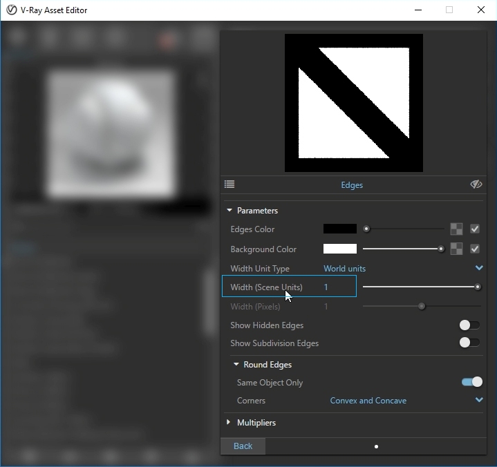
The edges of the building look very sharp, which is unnatural because almost everything has a little bevel. There are two ways to improve this: we can either work with the geometry of the house and model bevels, or we can use an edge texture that creates bevels at render time. I could use this texture in the bump slot of the material, but the concrete shader comes with a bump map and I don’t want to replace it and lose additional detail.
For this reason, I choose to use a bump material, assign the concrete as a base and use an Edges texture for the bump. I increase its size to one to match the scale of the scene and make the bevel more visible. The Edges procedural map makes edges look smoother and adds a little more detail. I apply it by selecting Use As Replacement, then choose my current material and select Replace; this is very helpful when a certain material is applied to objects in different layers. Using the Edges procedural map does not modify the actual geometry of the scene.
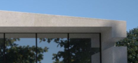
With Edges procedural map.
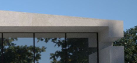
No Edges procedural map.
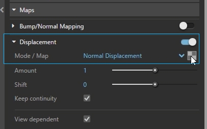
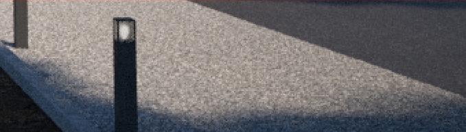
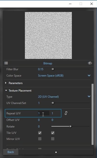
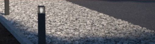
I want to create some gravel next to the house, so I use the standard Generic material with a seamless texture in the Diffuse slot. To create the look of pebbles, I enable Displacement and load a grayscale bitmap with the same texture as the diffuse, but with a lot more contrast. I assign this material to the path geometry.
After a quick render, I notice the pebbles look too small and the scale of the texture needs some adjustment. To change the tiling of the bitmaps, I open the texture placement rollout of the bitmap and change the Repeat U/V values to 0.3. Smaller amounts mean the bitmap will repeat fewer times on the surface. The same goes for the diffuse, which I want to match with the displacement texture.
The final touch for this material is to add a little reflectivity and make it more blurred. In real life, even the roughest materials have some reflectivity. After a quick render, I increase the Displacement Amount to three.
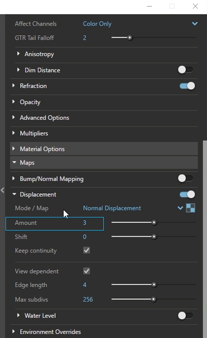
Repeat U/V = 0.3 Displacement amount = 1
Repeat U/V = 0.3 Displacement amount = 3
Atmospheric effects
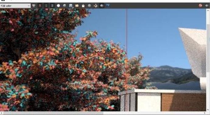
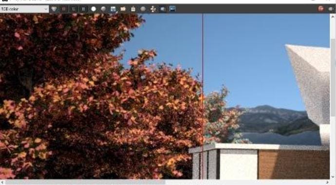
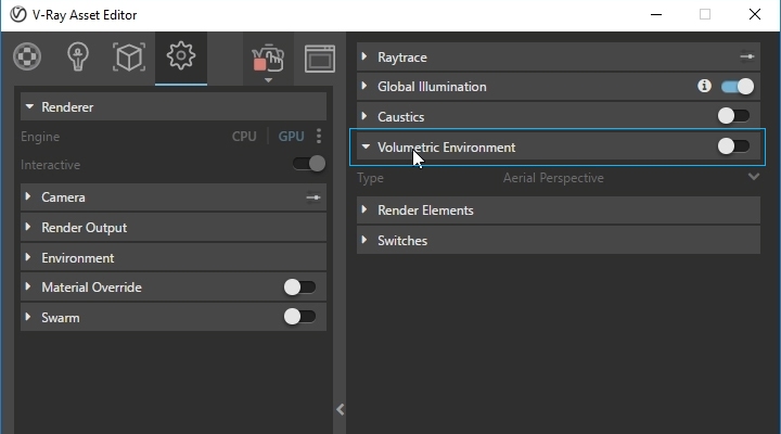
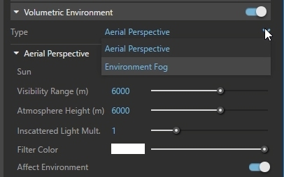
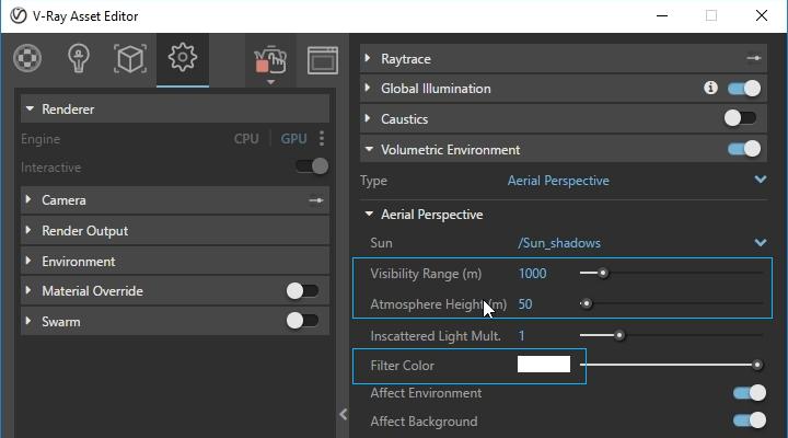
For the aerial perspective, I re-enable the grass and the render component in Grasshopper. To create visual depth in the scene, I also want to add fog in the distance. In real life, distant objects appear less saturated and sharp; a quick-and-easy way to achieve this is with Volumetric Environment.
If you’re not sure whether to use Aerial Perspective or Environment Fog: Environment Fog scatters light from the environment, as well as all light sources in the scene; this is the only way to achieve certain effects such as volume rays. When I am not aiming for such effects, I prefer to use Aerial Perspective; this simulates light scattering from the V-Ray Sun and Sky, which makes it faster to calculate.
Adjusting the Visibility Range affects the density of the aerial perspective. Lower values bring it closer, while larger values reduce the effect. The Atmosphere Height controls how far from the ground that this effect is visible. I use 1,000 for the Visibility Range and 50 for the Atmospheric Height, as well as slightly adjusting the color and adding a blue tint.
Final render settings
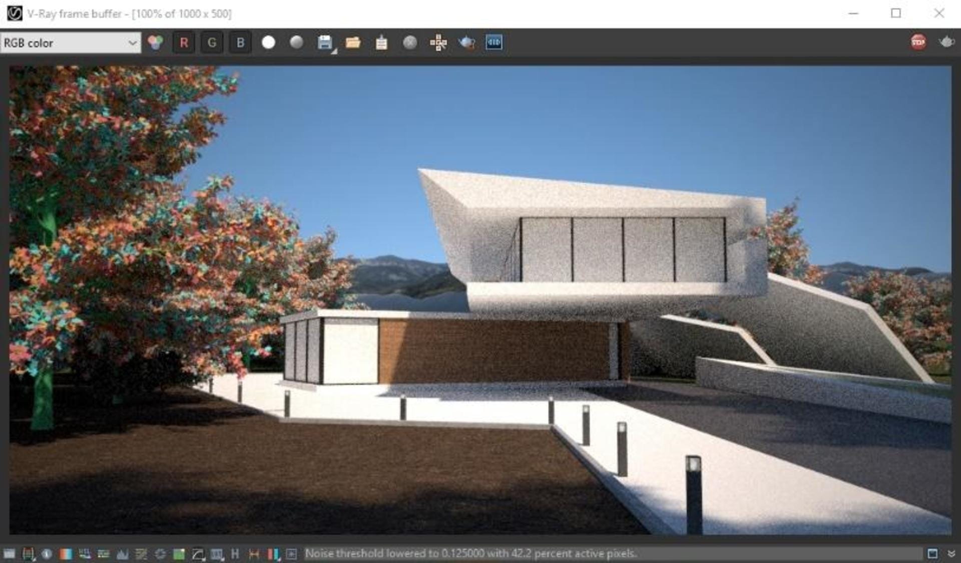
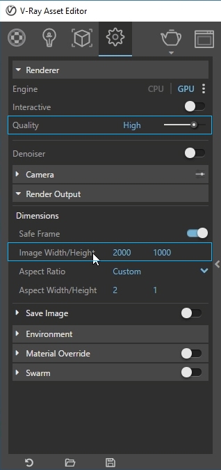
Setting up the project for final production rendering is as easy as adjusting a couple of sliders. First, I disable Interactive rendering, adjust the Quality preset to High, and increase the Dimensions of the image in the Render Output. And that’s it! All I have to do now is hit the Render button and wait for it to finish.
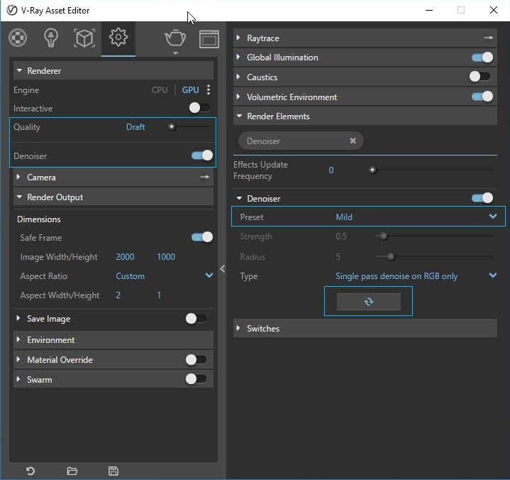
V-Ray Denoiser
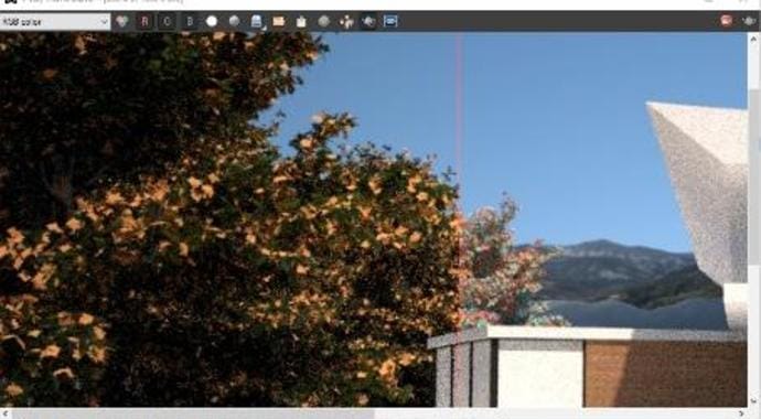
When I need a quick preview without a lot of noise, I use the V-Ray Denoiser. I set the render quality to Draft and enable the Denoiser. First, I try the Mild preset, but there’s still quite a lot of noise in some areas, so I change the preset to Strong and hit Update. There’s no need to render the image again; the Denoiser takes an existing render and smooths out areas with noise.
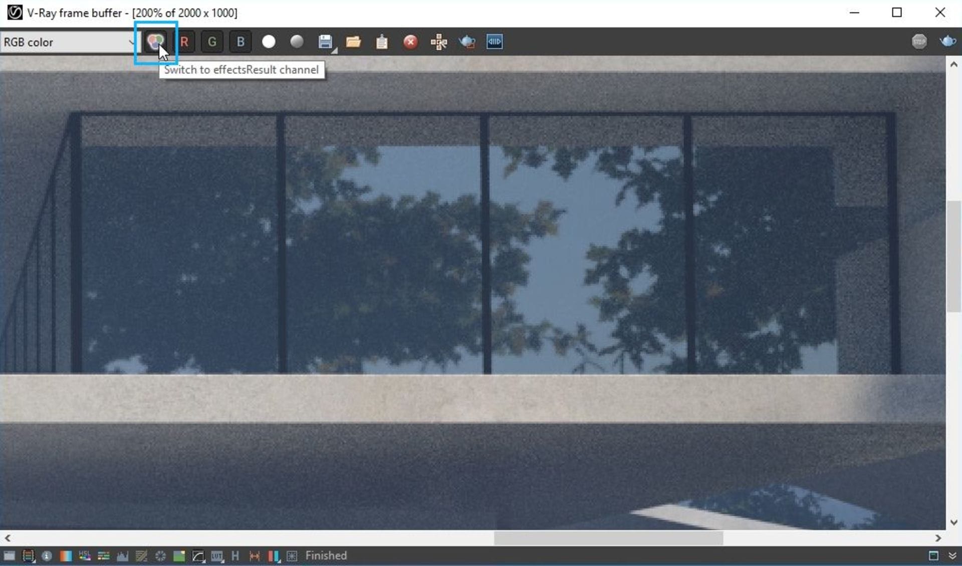
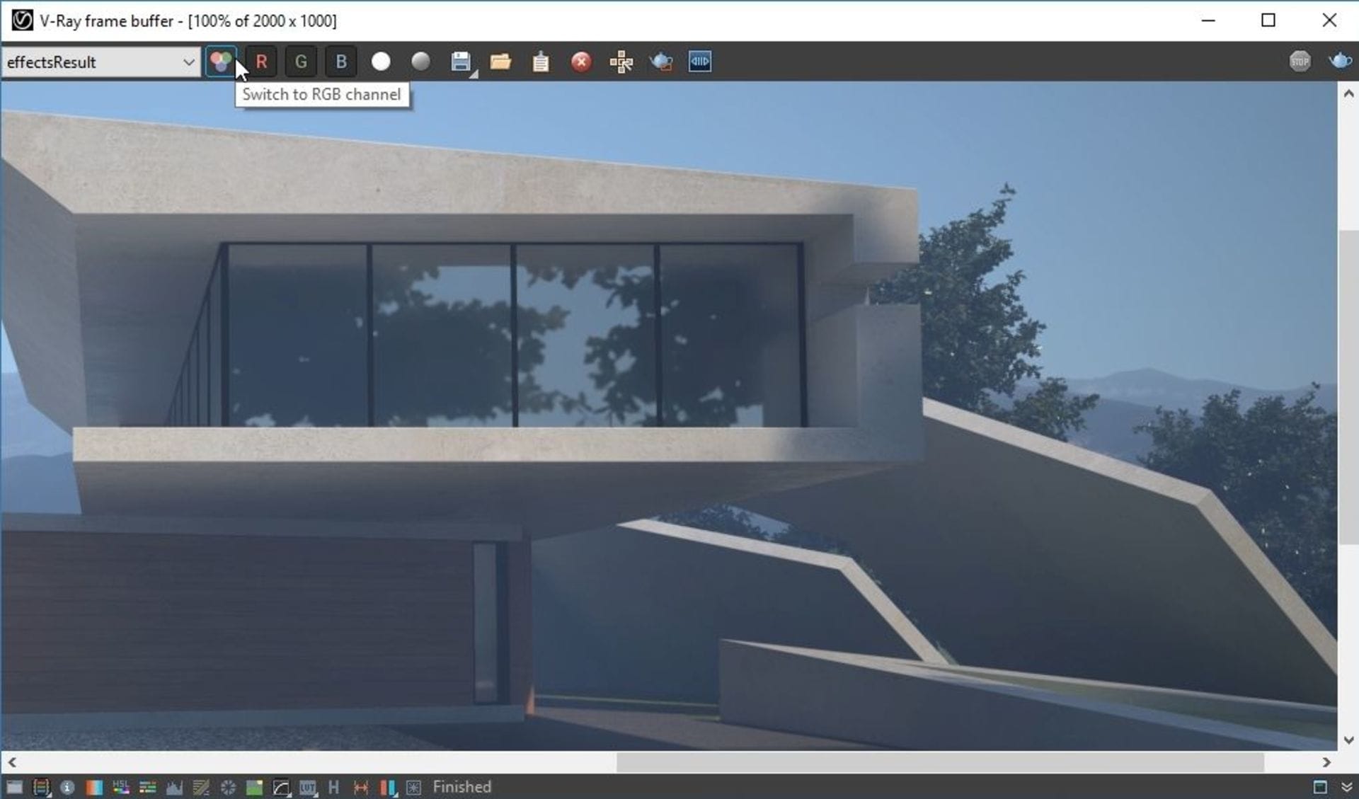
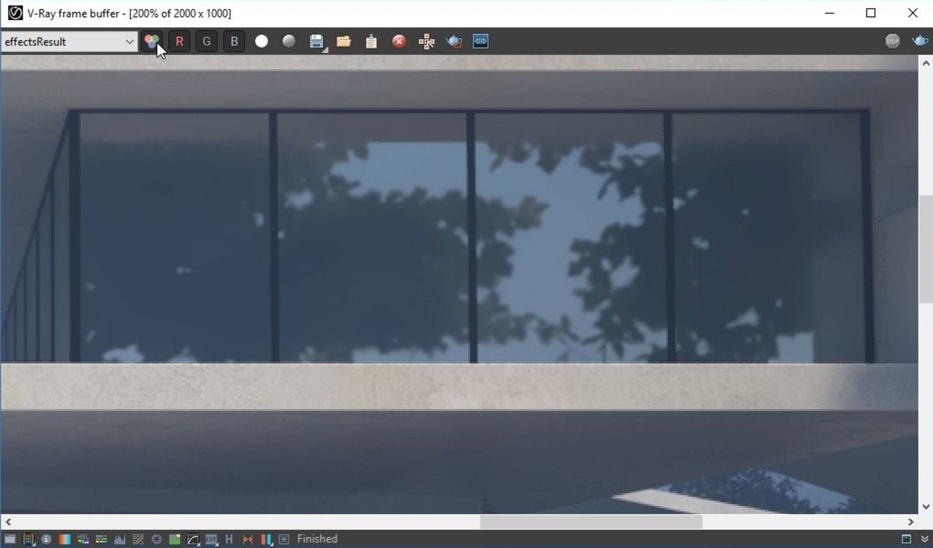
Speed reduction of the rendering process can reach 50%, depending on the scene, which makes it a great tool when you don’t have enough time to wait for a better-quality image. For final production rendering, I recommend a higher quality preset: use the Switch to RGB icon to toggle between the denoised image and its initial state.
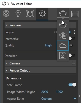
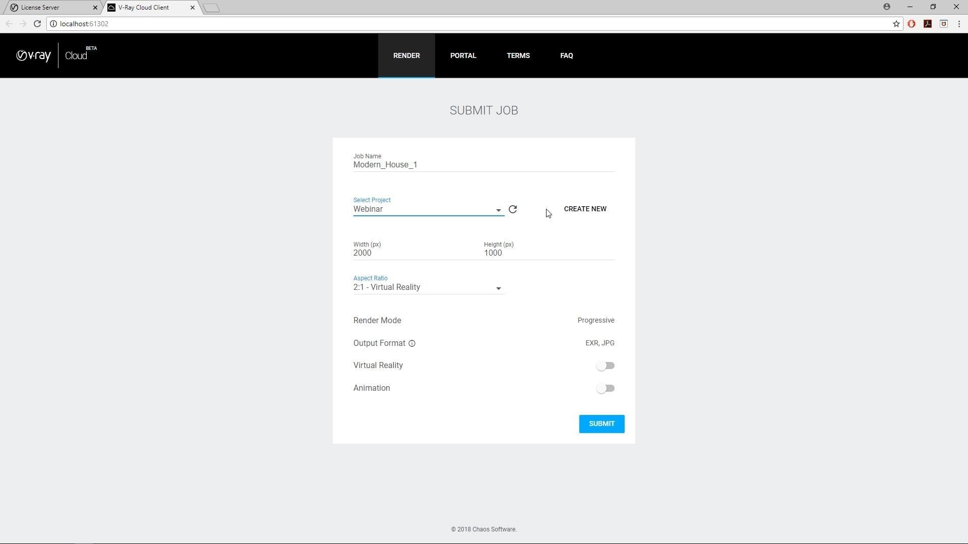
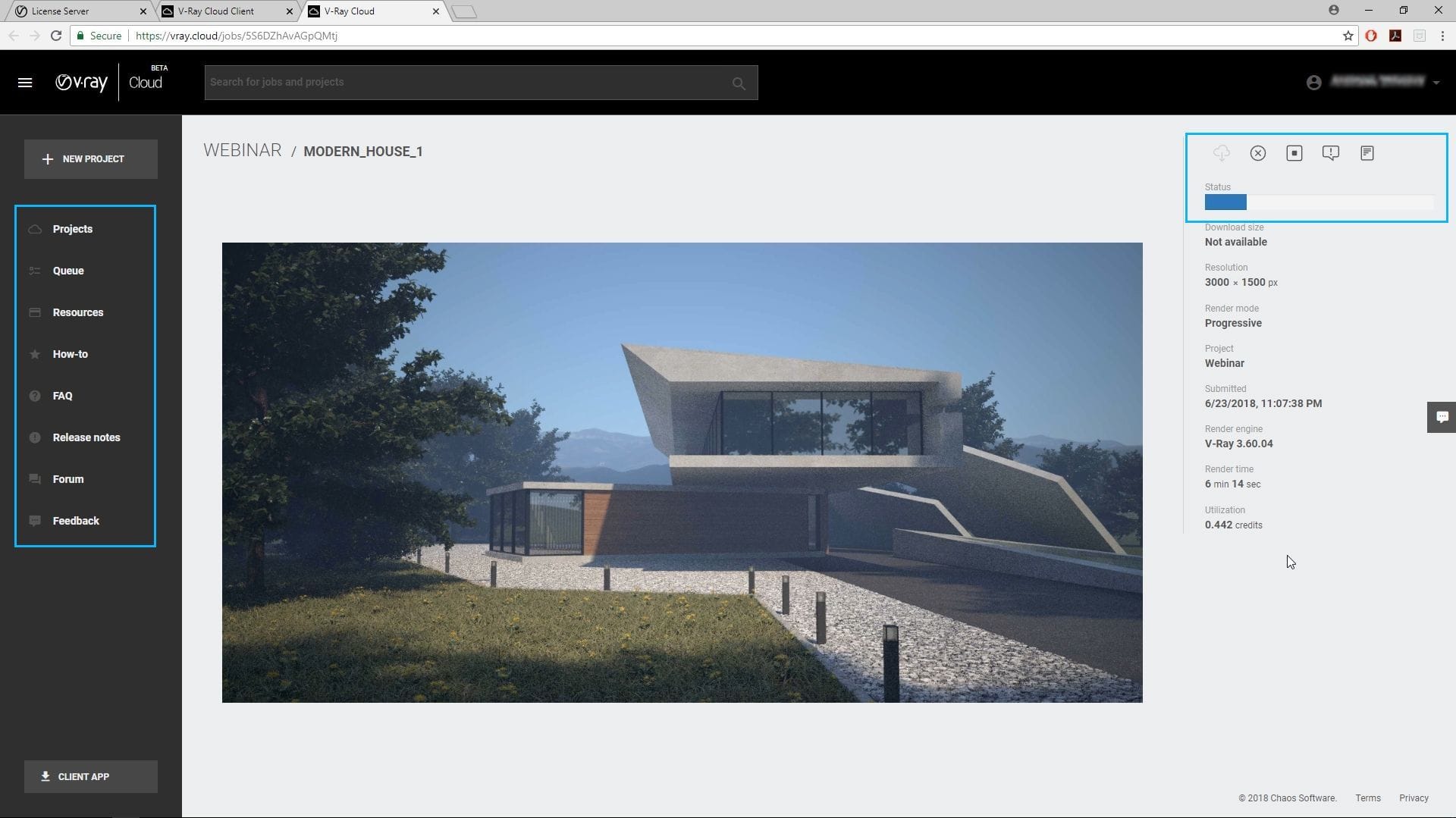
V-Ray Cloud
If you have a lot of projects happening at the same time or very short deadlines, V-Ray Cloud is on hand to help you out. It doesn’t require any additional knowledge such as setting up machines or installing plugins. To render on the Cloud, you have to prepare the scene as you would for standard production rendering (Final render settings step), but hit the Cloud button instead of Render.
In my case, I disable the Denoiser, change the quality to High and select the Cloud button. This opens a web page where I can rename the project, add it to a specific folder, change the resolution and click submit. The project is then uploaded together with all its assets.
V-Ray Cloud is handy when you need to render a high-quality image in a very short time or if you need to use your machines for another project. You can upload multiple scenes, follow the progress of the job on the browser of any device, and even pause or cancel it remotely.
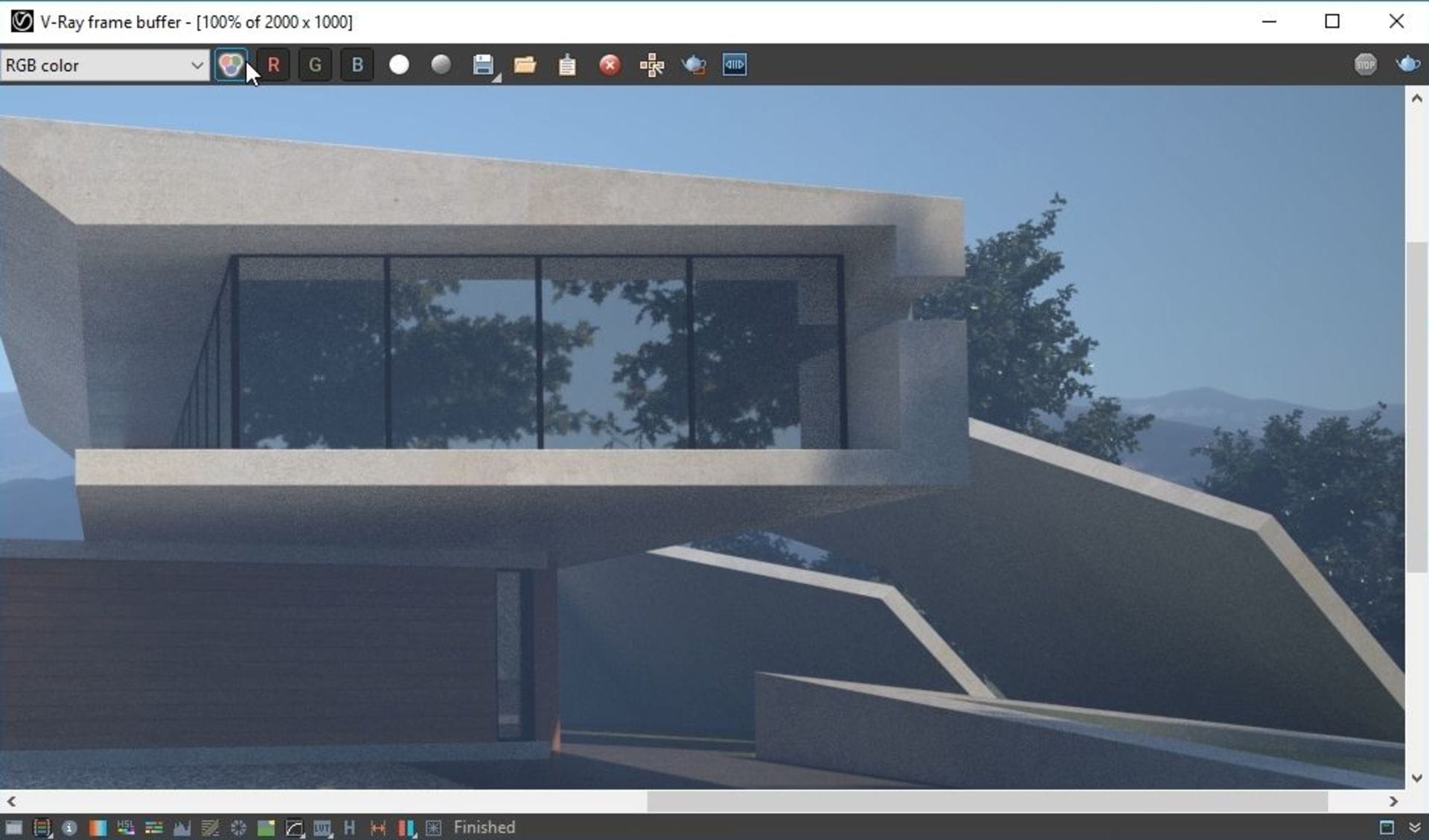
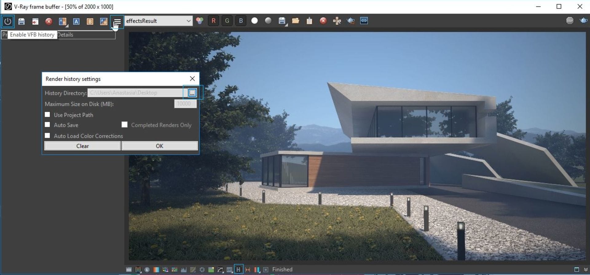
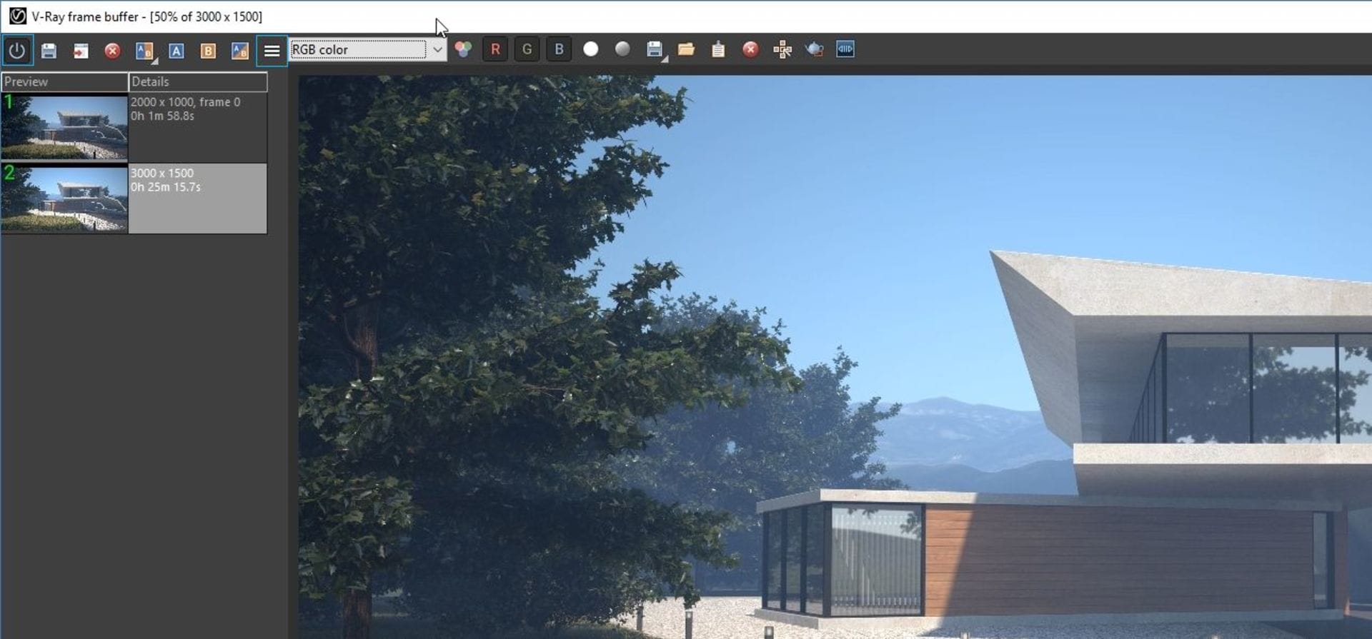
Frame buffer functionalities
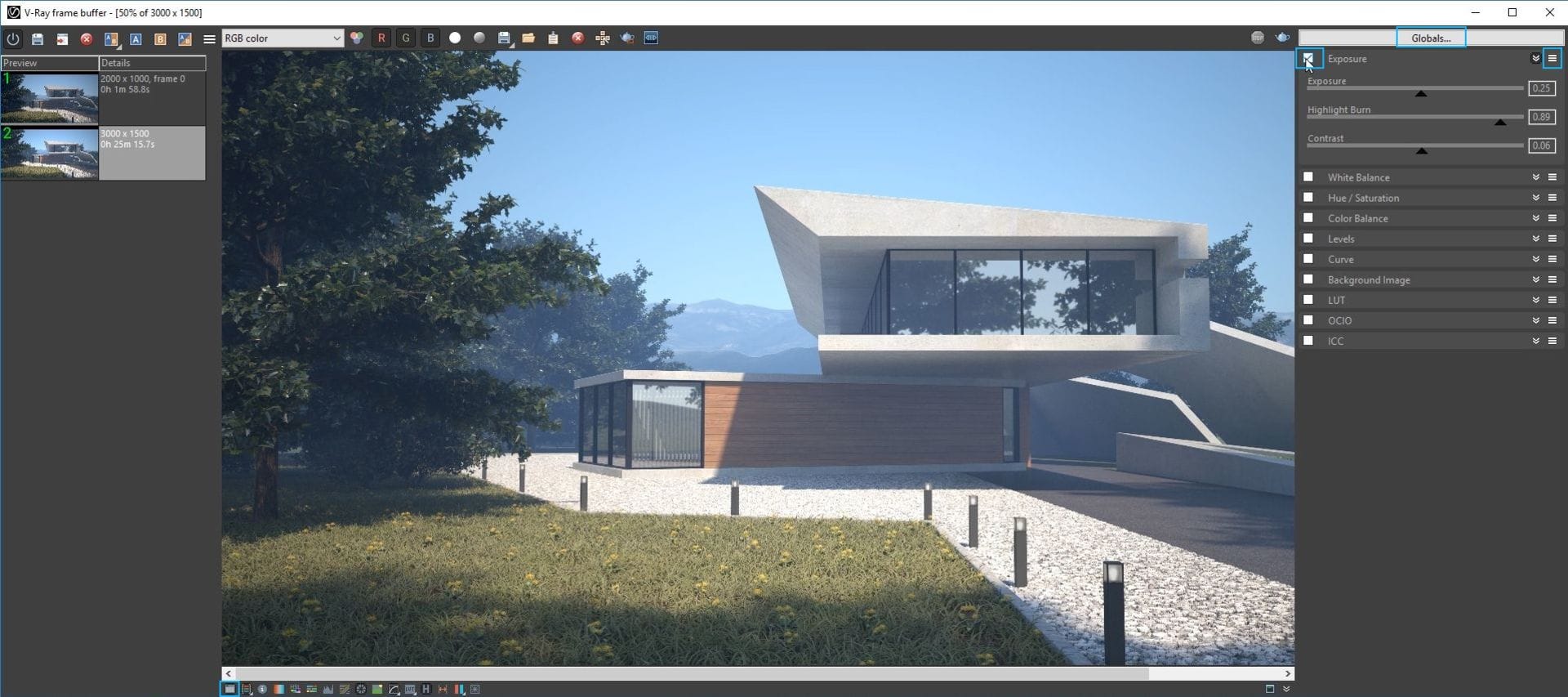
Once my render has finished, I can take care of final adjustments right in the V-Ray frame buffer. You can set a specific folder to save your image at different stages and compare the progress or various changes; this can be done by clicking on the H icon, which opens your frame buffer history.
In the Corrections control menu, you will find tools such as Exposure, White Balance, Hue/Saturation, Color Balance, Curve, Levels and more, which can be toggled on and off by clicking on the checkboxes next to them. In my scene, I slightly adjust the exposure, white balance (higher values make the image warmer; low ones make it cooler), and color balance.
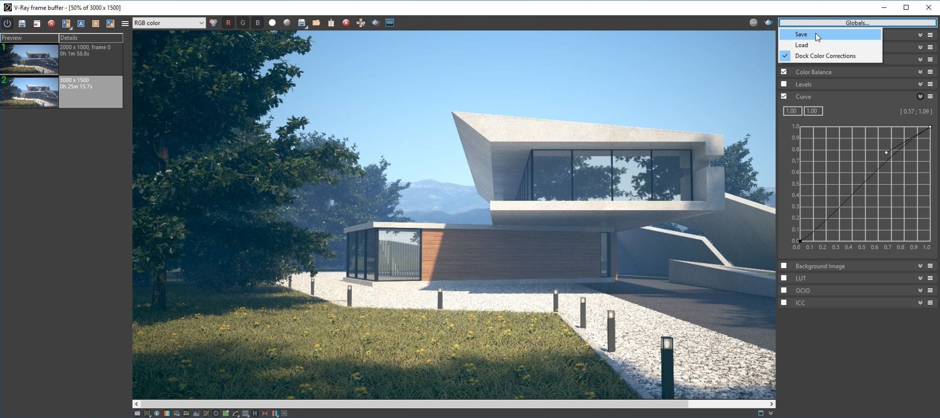
If I make changes I don’t like, I can undo them by choosing to reset from the options icon next to each of the rollouts. I often use Color Balance as it allows experimenting with the shadows, midtones and highlights — or all of them together. Curves is another powerful tool that can enhance your render; I usually aim for a sort of “S” shape.
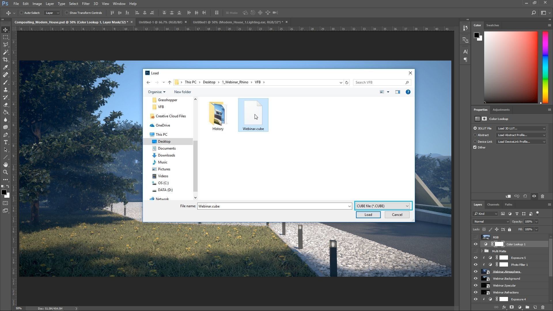
Once I’m done with my color corrections, I save them as a .vccglb file for use in other V-Ray projects. In this project, I also save the color corrections as an LUT file (*.cube) to load in Photoshop later.
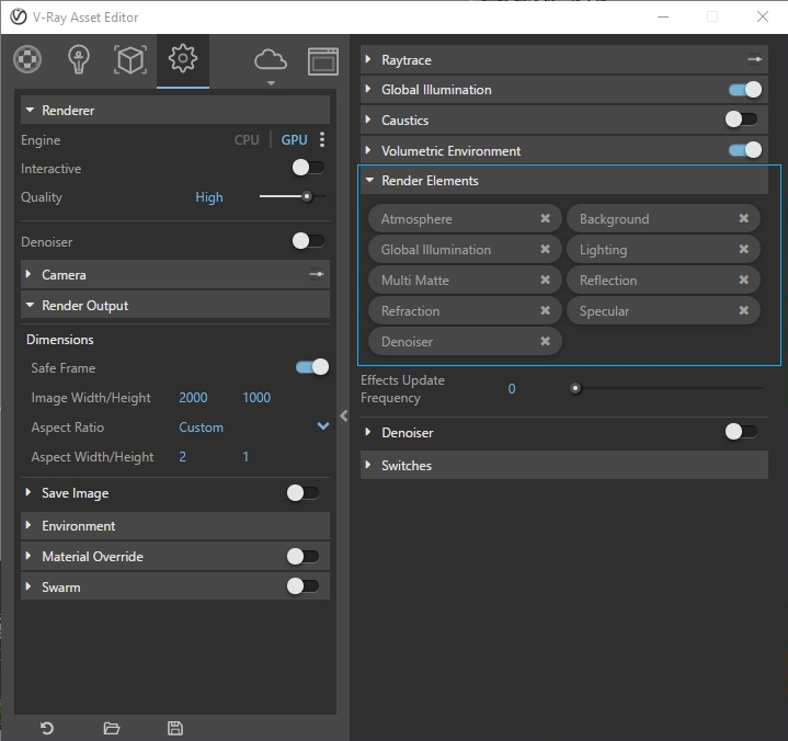
Render Elements and compositing
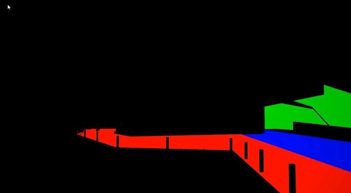
For more control over post-production, you can switch to Photoshop and use Render Elements to refine your image; these can be added from the Render Elements tab. To recreate the beauty pass, you will need Atmosphere, Background, Global Illumination, Lighting, Reflection, Refraction, Specular, and Self Illumination. If you don’t have some of the elements, you can skip them — in this case, there is no Self Illumination.
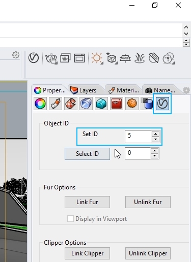
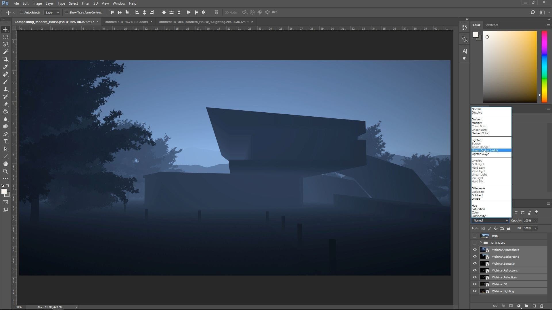
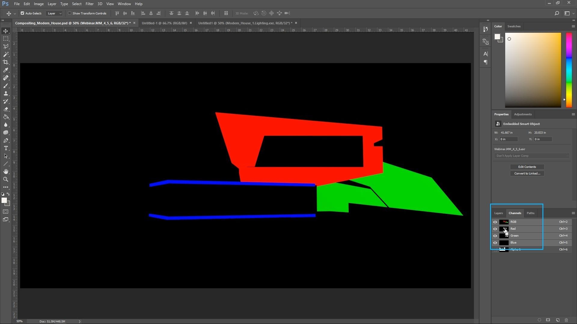
I add a new render element called Multi Matte, which creates RGB passes. These are especially helpful when you want to adjust a specific object in post-production, such as changing its color. For the Multi Matte render element to work, you need to set the render IDs from the properties of an object.
Post-production
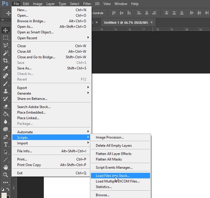
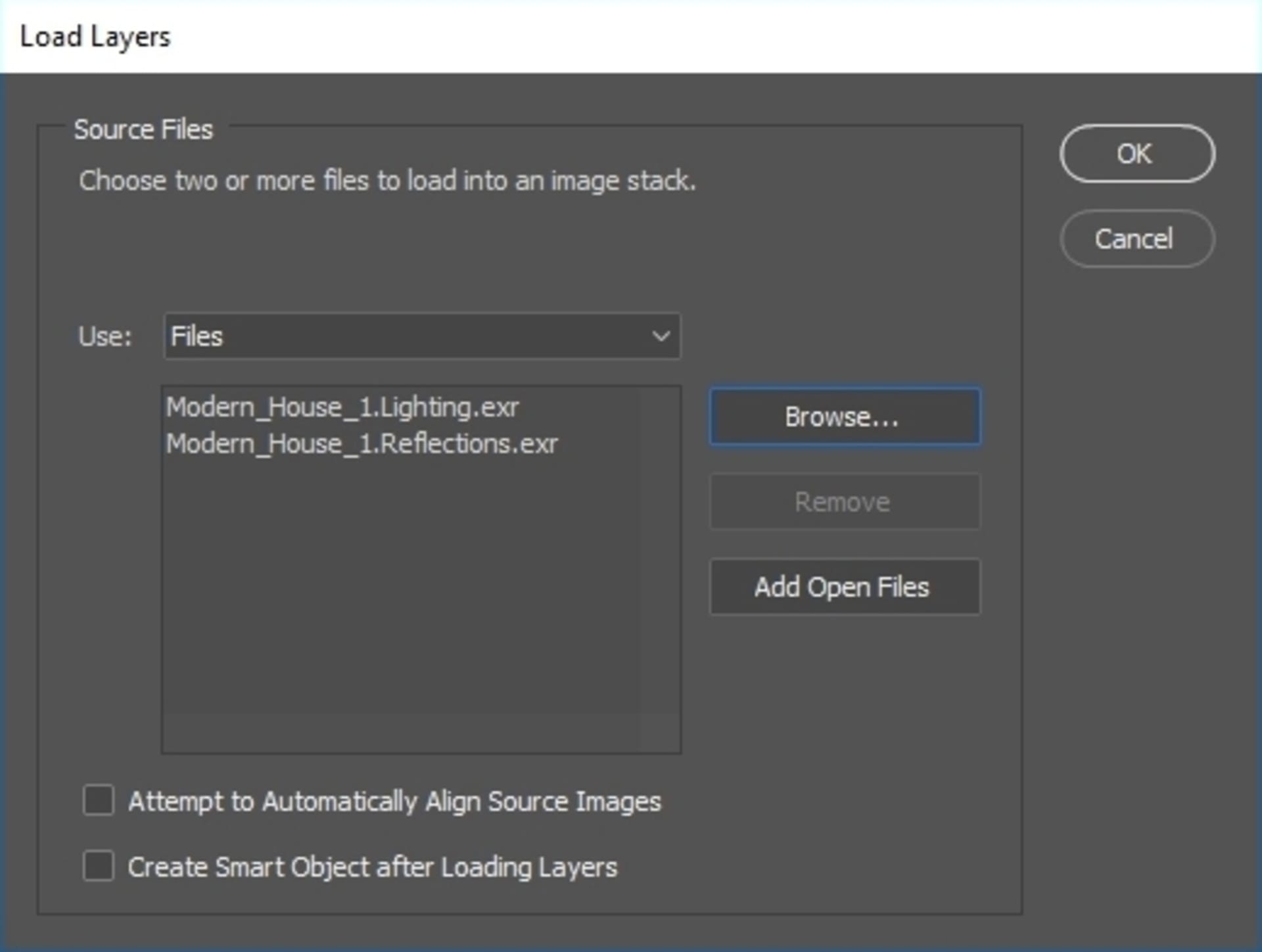
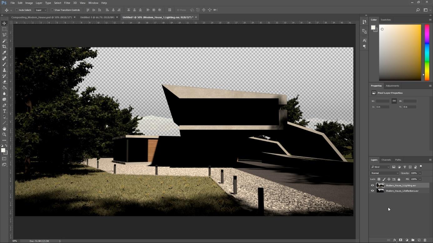
In Photoshop, a quick way to load all your render elements into one file is to choose File > Scripts > Load Files into Stack; select the render elements and click on OK. Keep in mind that the .exr will be loaded as transparency.
Depending on the project, this might be okay, but I want more control over the alpha. I choose to drag and drop all the render elements in Photoshop and select As Alpha Channel.
Depending on the project, this might be okay, but I want more control over the alpha. I choose to drag and drop all the render elements in Photoshop and select As Alpha Channel.
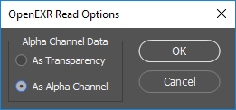
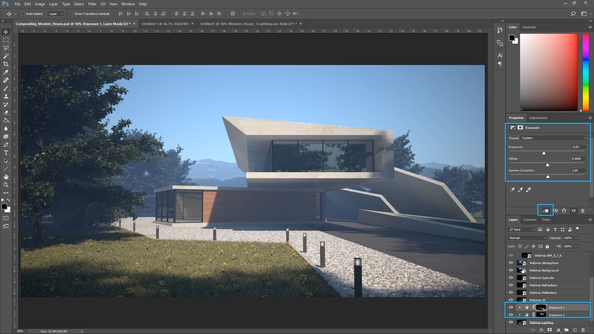
To recreate the beauty pass, I select all the render elements and change the Mode to Linear Dodge Add. Next, I adjust some of the elements. The gravel path looks a little overexposed, so I select the red channel from the corresponding Multi Matte, create an Exposure New Adjustment layer, clip it to the Lighting layer and slightly adjust it. I do the same for the house but use different values.
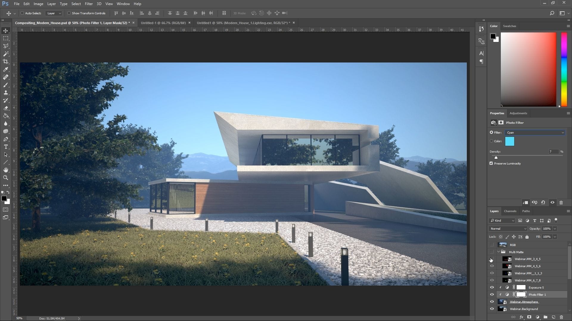
Once again, I select the right channel for the structure, create an Exposure New Adjustment layer as a clipping mask, and lower the values. I repeat the steps for the Global Illumination layer, and then increase the exposure in the Reflection render element to brighten it up. Next, I adjust the exposure of the Atmosphere layer to make it more pronounced; I then add a Photo Filter Adjustment Layer and change it to cyan to match the sky.

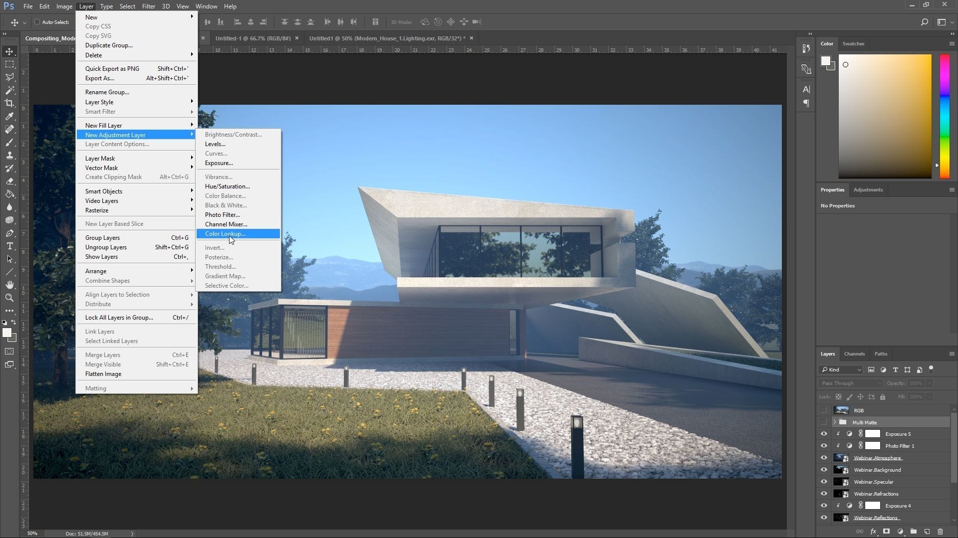
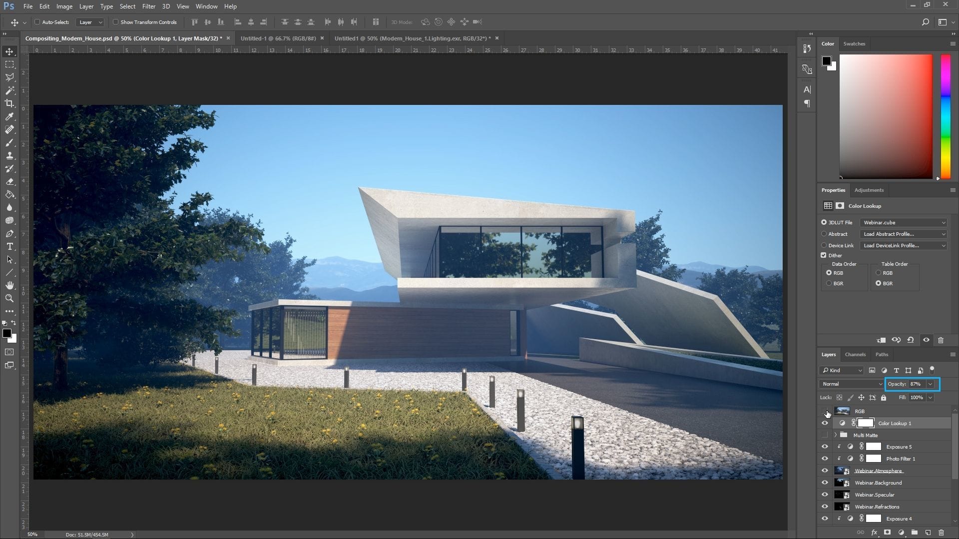
For the final touch, I use the color adjustments that I created in the frame buffer. To load them into Photoshop, I create a Color Lookup Adjustment Layer and load the color corrections as a 3DLUT File.
Bear in mind that, to load them in Photoshop, you have to save your color corrections from the framebuffer as an LUT file (*.cube). Initially, the result is too strong when combined with the other adjustments I made, so I slightly lower the opacity to counteract the effect.
The very last thing I do is to add a Photo Filter to increase the warmth of the whole image.
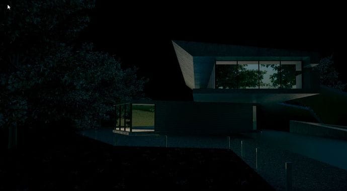
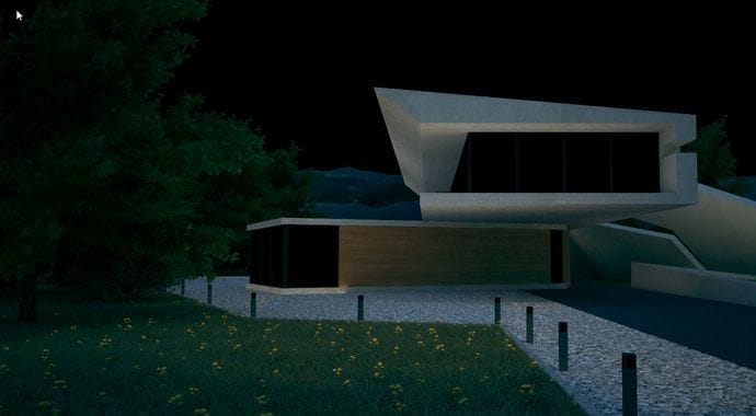
And that’s it! Those are the basic steps that I go through when handling basic compositing work. For the final image, I take the result of my compositing and refine it using simple brushes to add highlights and enhance shadows, as well as a couple of Color Balance Adjustment Layers.
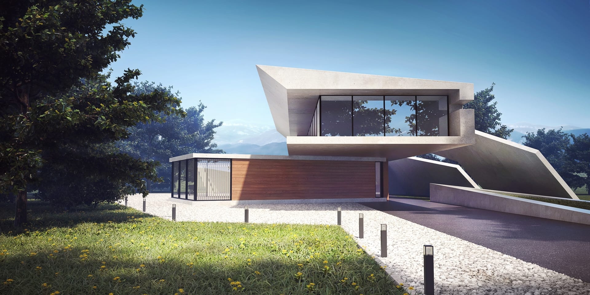
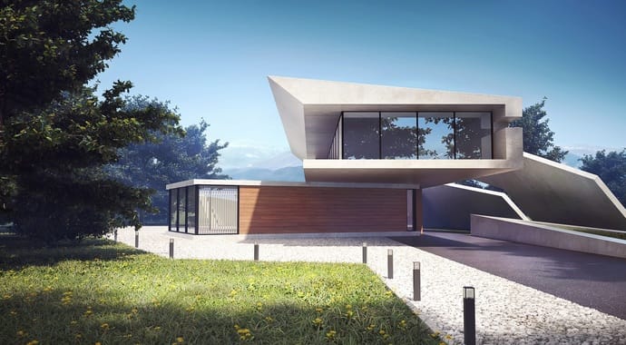
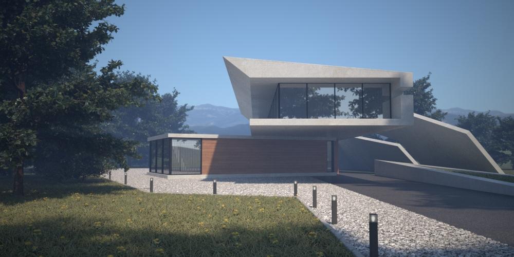
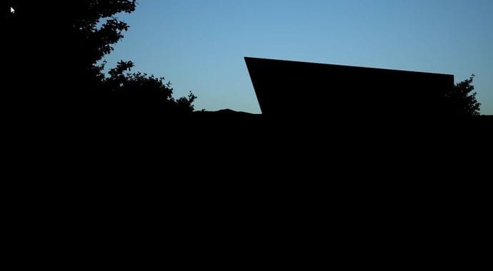
The final image.